Wednesday, October 17, 2012

MIAD part 2

 This was the first picture I took when we got to the coffee shop outside of MIAD. The broken sign at first attracted me to take this picture. The sign looks mangled, yet somehow cleanly cut and artistic still and I realized after taking it how the MIAD sign fit perfectly into the background. This sort of represents the entire day and brings me back there. The artistic ways that we saw in MIAD don't follow a cleanly cut rule but they still work out, like this picture did. I really like this picture and in the beginning I took it just for fun but it turned out better than I ever could have thought.


 The architecture in the Third Ward was very different and inspiring. Initially I liked the different feel of the blue light posts. In the past I was drawn to the light posts at my house and these offered a unique look that I can't find just down the street where I live. These really represent the different more artistic feeling of the Third Ward and that is what I like most about them. I have never really seen anything like it before and I was also drawn in by the unique lines and perspective available from underneath. I chose it as a contrast to the other lights that I have tried to draw and to keep myself looking at all of the different options that are out there that I just haven't seen yet.


This final picture I took when we were just messing around waiting to leave but it turned out, surprisingly, to be one of my favorites. The unique colors and architecture of the building is what first prompted my to take the picture, but it was also the nature that I wanted to incorporate into the photo.
This actually reminds me of middle school English class and that is because we read A Tree Grows in Brooklyn there. The shadow effect that I got from the tree behind me was completely accidental but I love it. It became the focal point of the picture which is something that is different, that i did not expect, that I still really like. It feels protected yet open to the new space that is the Third Ward and it worked out well. I'm sure there are other photographs that use shadows in interesting ways but I have never experimented with it like this before and it is something new that I will have to keep up.

MIAD group portion


 This drawing was by a MIAD student. I really like the use of the space and how the whole bird is not visible but the eye is still catching and the claw makes its way into the picture too. Therefore the composition is very strong as well as the craftsmanship. The detail throughout the drawing is impressive because the different textures look real and that is something that I want to learn to accomplish in my own work. The least effective pars is some of the white space around the claw and at the edge of the feathers. I would have preferred to see the entire circle, edge to edge, designed and sketched. The media looked like it was pen and I know I could never work in that because I love to erase and change my marks a lot but it still works very well here.


 This work of fish caught my eye as we walked through the work spaces in MIAD and it was done by another student there. The craftsmanship is the clearly the strength in the piece due to the unique look of the fish. There is a lot of use of color that adds to the strength and the different shapes of the fish ad to it. My favorite part is the eye, mouth and gill area of the red fish. Though the piece is unique and interesting I feel that one of the weaker points is in the repetition of the same fish on the same line. There is a little too much symmetry in that way and I would have liked to see something new. I love the detail though and I also feel the texture coming through very strong and I want to work on getting my skills up to that level.


This painting was by James Winn and it is called Full Moon Lotus: No. 12. It was done with Acrylic on Panel and I absolutely love this piece. There is a very realistic look in the craftsmanship and there is an interesting composition. The use of color is very strong as well even though it is in the dark, for the most part. The strongest part of this painting is the use of sunlight. The water reflecting off of the water behind the plants looks beautiful and the light coming off of the plants looks like a picture. I love how it is used also to highlight the yellow flowers in the background, creating a unique and well done balance. On of the weaker parts of the painting is the lack of light and interesting background on the left side, but all in all I think it is beautiful and well done.


Sunday, September 9, 2012

Word Project Research

Since I didn't know what my word meant, my first link is the definition of my word. I got a lot of my inspiration from the definition and specific words that were used here.
link 1
I had a lot of new ideas just searching the different uses and like places where is would be used so this website is responsible for a great amount of my inspiration relating to prom.
link 2
There are many different creative projects that involve my word and some the ideas on the website got me thinking about different options I could do that are more out of the box. There are some pictures that also gave me some totally new thoughts on all of the different possibilities.
link 3

Thursday, September 6, 2012

Summer Growth

This summer working on art has helped me grow in my own style. I never had the chance to take drawing in high school but through the sketching I really got back to that, which is why I first liked art. I liked experimenting with different things to draw and I now know that I like to draw close up images not full landscapes. The different main shapes and shading with shadows is what I most enjoy to look at and attempt to portray in my work. I even like to do things in black and white to exaggerate the different shades I can accomplish but I want to still incorporate a lot of colors this year also.

Sunday, September 2, 2012

I went to the website for art and writing awards and the work there from people my age is incredible. From photography to writing I appreciated the paintings most because I have experienced some of the difficulty there. There are so many people even younger than me with such amazing talent I can hardly believe it.

This first painting was done by a fourteen year old and I think its looks really good. Its more of a simple idea for a painting but all of the flowers look just right. I like how there are many different colors and shapes even in a work this seeminly simple.
Bottled Montana Fields

The second picture I picked is something similar to pictures I took this summer. I would really like to paint skies but they look challenging and I think this painting did a good job with the different colors that were needed. I like how realistic it looks also and that is something I want to have in all of my work.
summer nights

Thursday, August 30, 2012

Milwaukee Art Museum

I searched the Milwaukee Art Museum to see the permanent galleries and the changing exhibits close to home. I have gone there before but not recently so I wanted to see how things have changed. There is a new posters of Paris collection that look interesting but I prefer paintings or unique crisp photos.

I chose this piece of art because of the interesting movement that caught my eye. This shoes an interesting use of light and swirling shapes that I have learned from and hope to someday use in my art


Feature image for Currents 35: Tara Donovan
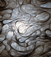
I chose this next picture because of the use of black and white. I want to use this in my artwork and play with different shadows and close up images.
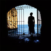
Feature image for Currents 34: Isaac Julien

Sunday, August 26, 2012


Photo 1I visited the website http://arts.state.wi.us/static/ and there were a lot of cool grant opportunities. One that stuck out to me dealt with getting artists involved in the communty. I thought that was really special because it is important for people to see and understand the artist in their area and it is important for the artists to help those around them. A beautiful communty reflects better upon everyone living in it.

I chose to look at this picture because I like the feel of nature in artwork but this has an added piece of something a little different. I want to try to put a spin on things like this instead of always doing what is predictable.

I thought this painting was really interesting because it is so different from any of the pieces I have done. I like making it look very neat and precise but these brush strokes are bigger and less extact than what I am comfortable with. I would still like to experiment with different styles this year though.
John Emil Stevenson, "Woman Spinning Wool"